
Merchants generate a lot of data that our systems track and all this data is being stored and used dynamically in our system. These information will help our merchant visualize how their Payment Processors perform such as Transactions and other details that is implemented on certain Integrations. The Transactions Report is the main piece representing a bulk of our data but this can also be used to figure out trends and other behavior at a macroscopic level since it was intended for the ground level analysis per each individual transaction of each individual customer. Dashboards, on the other hand, are a breathing extension of what our platform can offer our merchants with data driven insights of how their customers behave. Below is a sample screenshot of the OpenPath Dashboard.
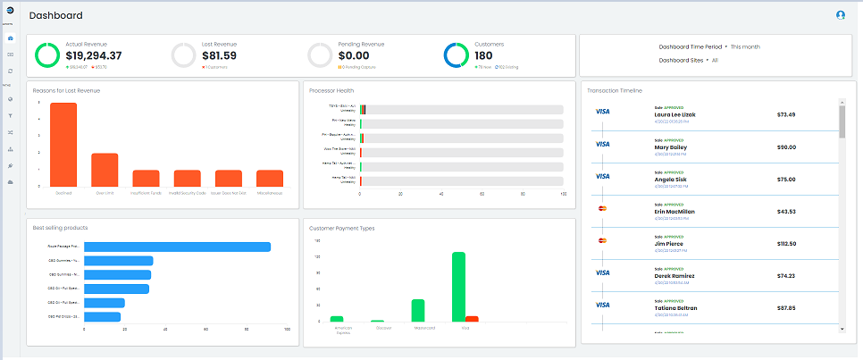
Revenue and Customers
These pie charts represent the merchant’s transactions in view of their Revenue. These can be filtered by Time Period and Sites by clicking the drop down menu on the right. The screenshot below shows the Month to date Sales across all Sites.

Actual Revenue - Represents the actual money approved and processed via their processing account. It measures that amount by every transaction that was captured and approved, subtracting off the amount of money charged back or refunded.
Lost revenue - Represents the amount of potential money lost from attempted incomplete and abandoned purchases by customers i.e. abandoned carts etc. A customer who tries to make a purchase in the store, gets a rejected attempt, and chooses not to return with a different payment method is considered part of this lost revenue.
Pending Revenue - Represents the pending money held in transactions that have been authorized but not yet captured for settlement.
Customers - Represents the number of unique customers attempting purchases at the merchants’ store. A new customer is one that has not attempted a purchase before at the store until the transaction occurred while an existing customer is a returning customer making a purchase who has made purchases in the past.
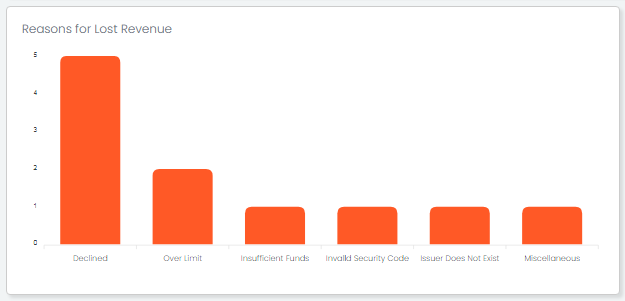
Reasons for Lost Revenue
This represents the reasons customers receive for declined transactions from the merchants’ processors or banks.
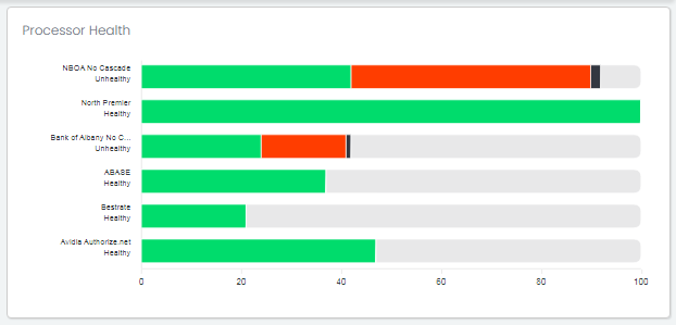
Processor Health
This graph shows the general responses merchants are receiving in their transactions. For each active connector the merchant has set up, a chart displaying the amount of money approved, declined, error-ed, and available for future processing is generated. The connector is also labeled with a corresponding status of ‘healthy’ or ‘unhealthy’ indicating whether the connector is having more than 90% of its attempted transactions, which does not include available amount left, approved and processed properly.
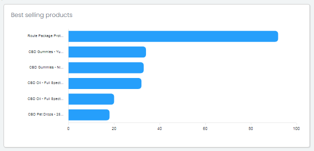
Best Selling Products
A frequency graph that displays the top 6 most purchased products from the merchant. Only approved transactions are used to calculate the frequency at which products were purchased along with each approved transactions’ products’ quantity.
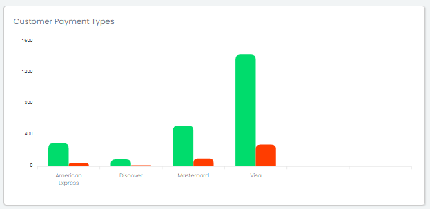
Customer Payment Types
This graph represents the frequency of which credit card brands or other payment methods customers use. The transactions’ outcomes, whether approved or declined are displayed. This graph also shows at a glance what payment method type tends to cause issues versus the amount of money approved accepting them.
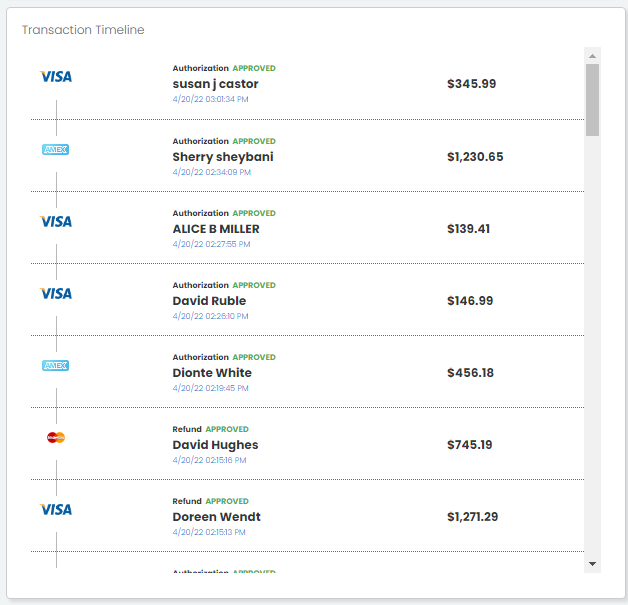
Transaction Timeline
A timeline chart that displays transactions happening for the merchant during the time-frame set for the dashboard. Via this timeline, the merchant is able to understand how transactions were performing individually, and in context to other transactions occurring at the same time. The transactions are listed in chronological order.
Comments
0 comments
Please sign in to leave a comment.